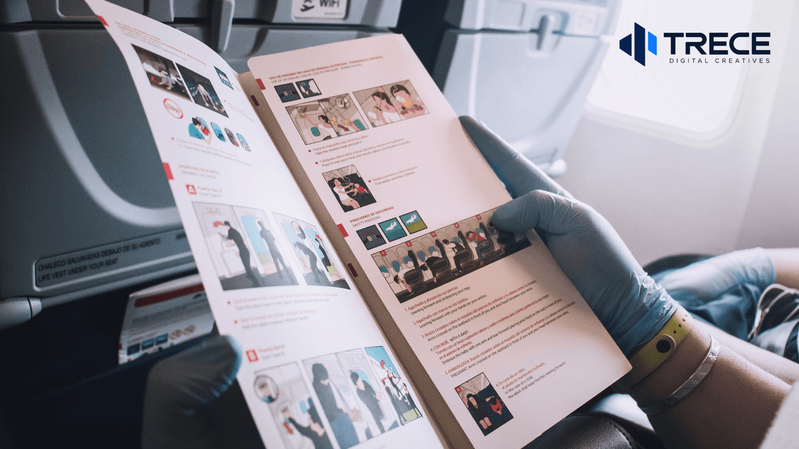


A well-designed brochure should look clear, balanced, and easy to follow. Its cover should communicate the main idea at a glance. Inside, short sections, readable text, relevant images, and consistent spacing should guide the reader toward one next step. A professional brochure does not need elaborate graphics. It needs a layout that makes important information easy to find.
The right appearance depends on whether the brochure will be handed out, displayed, emailed, or used during a sales conversation. Here is how to choose a format and build a layout that fits its purpose.
What Makes a Brochure Look Professional?
A cover with one clear focal point
The front cover should show what the brochure is about without asking the reader to study it. Use a specific headline, one strong photo or graphic, and your business name or logo. Leave detailed service descriptions for the inside.
For example, a brochure about office cleaning might feature a photo of a clean workspace with the headline “Commercial Cleaning for Your Workplace.” That tells the reader more than a cover that only says “Our Services.”
The University of Florida’s brochure design guidance also recommends using the cover to capture attention while keeping detailed information on the inner panels.
Headings and text that are easy to scan
A reader should be able to spot the headline, section headings, and key points before reading every sentence. Make headings visibly different from body copy, but avoid using a different font for each section.
For a printed brochure, the University of Florida guide identifies 10- or 11-point body text as a common starting point. That is not a universal rule: narrow columns, typeface choice, and the intended audience may call for larger text. Always judge readability at the actual printed size, not while zoomed in on a screen.
Enough space around each element
Empty space is part of the layout. It separates one idea from another and prevents the brochure from looking crowded. Keep consistent margins around panels, space between paragraphs, and alignment between images and headings.
Avoid stretching a paragraph across a fold or squeezing text into every available corner. If the brochure feels full, remove lower-priority details or choose a format with more room rather than shrinking everything.
Images that support the message
Use photos to show a product, the type of work offered, or the result a customer can expect to understand. One relevant, high-quality image is often more useful than several unrelated decorative photos.
Keep image crops consistent when placing photos side by side. Avoid putting important text over busy image areas, and confirm that you have permission to use the images. For print, use files suitable for the intended physical size rather than small screenshots.
Consistent brand colors and readable contrast
Choose a limited color palette that works with the logo and use it consistently for headings, backgrounds, and highlights. The goal is to help people recognize sections, not to make every panel compete for attention.
Make sure words stand out from their backgrounds. The W3C’s guidance on text contrast explains why sufficient contrast matters for readable digital content. The same visual principle is useful when reviewing printed brochures, though print appearance also depends on the paper, ink, and lighting.
A visible next step
A brochure can look attractive but still leave people unsure what to do. Make the primary action easy to find, such as “Request a Quote,” “View Our Products,” or “Schedule a Consultation.” Pair it with the appropriate contact details or website link.
The call to action does not need to dominate every panel. It should be noticeable wherever the reader is likely to finish.
Which Brochure Layout Should You Choose?
Tri-fold brochure: a compact service overview
A tri-fold uses two folds to create six panels on one sheet. It is useful when you want a portable brochure with several short sections, such as an introduction, a few services, and contact information. US Letter paper (8.5 by 11 inches) is a common starting size, but the final dimensions should match your printer’s specifications.
A tri-fold looks best when each panel has a distinct role. It is less suitable for long explanations, large comparison charts, or many detailed product descriptions.
Bi-fold brochure: more room for each section
A bi-fold has one fold and four panels. Its wider panels can accommodate larger photographs, a straightforward service explanation, or a simple presentation-style layout.
Choose it when you want fewer, more spacious sections instead of six compact ones. The tradeoff is having fewer separate content areas.
Multi-page brochure: a detailed presentation
A multi-page brochure or booklet gives each product group, service category, or case study more room. It can use full-width photos, comparison pages, and repeated section layouts to make longer material easier to navigate.
More pages are useful only if the information needs them. A short brochure with a clear visual structure is better than an oversized booklet filled with repetitive text.
Digital PDF brochure: designed for screens
A brochure intended mainly for email or website sharing does not need to imitate a folded print sheet. A page-by-page PDF with clear headings, comfortable text sizes, and clickable website links may be easier to read on a phone or laptop.
If you also need a printed version, consider separate layouts for screen reading and the printer’s trim and fold requirements rather than assuming one file will be equally comfortable in both formats.
What Should a Tri-Fold Brochure Look Like Inside?
For a common letter-fold tri-fold, the flat sheet usually follows this arrangement:
- Outside of the sheet, left to right: fold-in flap | back cover | front cover.
- Inside of the sheet, left to right: inside left panel | inside center panel | inside right panel.
This is the flat artwork arrangement, not the order in which someone reads every panel. The cover appears first, followed by the flap when the brochure opens, then the full three-panel inside spread.
A practical visual plan is:
- Front cover: a clear headline, a primary image, and a modestly placed logo.
- Fold-in flap: a short introduction or key benefit that encourages the reader to open the brochure fully.
- Inside spread: three organized sections, such as the service overview, available options, and what happens next.
- Back cover: the main call to action, website, and relevant contact information.
The exact panel arrangement changes for other folds, such as a Z-fold. Before building the final design, fold a blank sheet, mark each panel, and open it flat. That simple test helps prevent putting the cover or back panel in the wrong position.
Three Brochure Layout Examples You Can Adapt
These are hypothetical design examples to illustrate how the layout can match the reader’s needs.
Example 1: Home-service company with a tri-fold
Visual direction: A large service photo on the cover, a bold headline over a simple color block, and plenty of space around the logo.
Inside layout: The first panel introduces the service area and the main type of work. The middle panel uses three short service blocks with small supporting photos. The final inside panel explains the inquiry process with simple steps.
Back cover: A clear “Request an Estimate” heading, a website, and a contact method.
Why it works: The panels let someone understand the services quickly without reading a long company profile.
Example 2: Consulting firm with a bi-fold
Visual direction: A clean front cover with a short positioning statement, one geometric brand graphic, and generous white space.
Inside layout: One wide panel explains who the firm helps; the other shows its core services and a simple three-step engagement process. Use small icons or numbered sections rather than several stock photos.
Back cover: A concise invitation to schedule a conversation and the relevant contact details.
Why it works: Wider sections create a calm, organized look that suits a service requiring explanation rather than a large product gallery.
Example 3: Product company with a multi-page booklet
Visual direction: A strong product image on the cover and a consistent page layout that repeats throughout the booklet.
Inside layout: Divide products into categories. Give each category a clear heading, consistent product image sizes, and a short description of the distinctions that matter to buyers. Use comparison tables only when the specifications genuinely help the reader choose.
Final page: Ordering or inquiry details, a website link, and a direct next step.
Why it works: Customers can compare options without sorting through unrelated information on a single crowded page.
For additional visual reference, VistaPrint’s collection of brochure examples shows how photo-led, minimal, and promotional layouts use different combinations of images, color, and text.
Common Brochure Design Mistakes to Avoid
- Using too many fonts or colors: Build contrast with a clear hierarchy and a consistent palette instead of constantly switching styles.
- Filling every empty space: Remove secondary details or increase the available space. Crowded panels are harder to scan.
- Making the logo the entire message: Readers should understand what the business offers, not only recognize its name.
- Using small text to fit more copy: Review the layout at its actual size. If text is difficult to read, shorten the copy or expand the format.
- Placing key words on folds: Keep headings, faces, and essential details clear of crease lines and trimming areas.
- Hiding the call to action: Give readers one obvious way to continue after reviewing the brochure.
How to Check a Brochure Before Printing or Sharing It
Use this quick design review before approving the finished file:
- Try the five-second glance. Can someone identify the business, the main offer, and the next step without studying every panel?
- Check at actual size. Print a sample when possible, or view the digital layout at a realistic scale. Make sure the smallest important text remains readable.
- Test the fold. For printed brochures, use a paper mockup to confirm panel order, alignment, and spacing around creases.
- Confirm the print setup. Ask your printer for trim dimensions, safe areas, fold allowances, and bleed requirements. Adobe’s print-bleed guide explains how artwork extending to the edge must continue beyond the trim line; 0.125 inch (3 mm) is common, but your printer’s specifications take priority.
- Test the digital version. Open the PDF on both a phone and computer. Check the reading order, clickable links, and any QR code using a real device.
A useful final question is whether the design makes the reader’s decision easier. If the important message disappears behind decoration, simplify the layout.
Need Help With Your Brochure Layout?
If you have the content but are unsure how to arrange it, Trece Digital Creatives can help you turn it into a clear brochure for print or digital use. Explore our Marketing Materials Design service and ask about our free 2-hour trial task to get started.